Brand Color Impact: Lighting Psychology Drives Sales
By Chidi Okoye • 3rd Oct
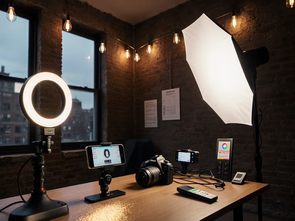
When brand colors shift under poor lighting, color psychology lighting becomes a silent sales killer. The precise spectral composition of your lights dictates whether your subject's skin appears healthy or sallow, and whether your product's signature hue matches the customer's expectation. This isn't aesthetic preference; it is measurable brand color impact confirmed by both TM-30 fidelity indices and consumer return rates. As a spectral specialist who bridges lab measurements with real-world shoots, I know accurate color representation starts before the camera (is it a continuous spectrum light source, or a spike-filled one that creates metameric failure?).
How does lighting physics actually drive color psychology in branding?
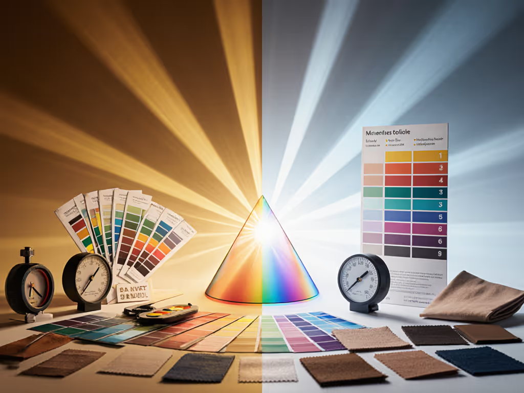
True color psychology lighting begins with understanding that human emotional responses to colors aren't fixed; they are conditional on spectral fidelity. Marketing color theory often presents simplified associations ("blue = trust"), but these only hold when lighting renders colors accurately. A dress perceived as emerald green in sunlight might appear muddy gray under cheap LEDs due to a spectral gap at 620nm (a real incident I witnessed in a boutique shoot). The shoppers saw green; the camera saw gray. Why? Because the emotional response colors evoke depends entirely on their spectral integrity under your specific lighting.
This is where SPD (Spectral Power Distribution) plots become essential diagnostic tools. Lights with continuous spectra maintain color relationships across the visible spectrum, while those with sharp peaks cause certain wavelengths to dominate or disappear entirely. TM-30-18 metrics quantify this through Rf (fidelity index) and Rg (gamut index): values below Rf 80 and Rg 95 indicate significant color distortion that directly undermines your brand's intended emotional impact. For equipment choices that maintain accuracy, compare continuous vs strobe lighting to select a system that preserves brand hues.
What specific lighting parameters should I prioritize for brand color accuracy?
Begin with spectral continuity over maximum output. Lights scoring Rf ≥ 90 and Rg 100-105 provide the spectral foundation for reliable brand color impact. While lighting color temperature (CCT) gets attention, it is secondary to spectral shape. Two 5600K lights can render skin tones radically differently based on SPD continuity.
Here's my hierarchy of lighting priorities for brand shoots:
- Spectral Power Distribution: Verify continuous spectrum with minimal gaps (especially in 550-650nm critical for reds/skin tones)
- TM-30 Metrics: Target Rf ≥ 90, Rg 100-105 for balanced fidelity without oversaturation
- CRI (Ra) as secondary check: Only meaningful when Rf ≥ 85
- CCT consistency: Verify minimal shift across dimming range (critical for run-and-gun creators)
Most consumer-grade LEDs fail at #1. They look white to our eyes, but collapse critical spectral bands. This creates what I call "metamerism traps": colors that match under one light (your set) but not another (retail or sunlight). For small-space shooters, this is catastrophic when your client's e-commerce photos show mismatched product colors.
Why do skin tones matter more than product colors in lighting decisions?
skin tones first; everything else negotiates around them.
Human vision is exquisitely tuned to skin tone variations, which is evolutionarily critical for detecting health cues. Even 2-3 Delta E color differences in skin go unnoticed in products but trigger uncanny valley discomfort in faces. This is why skin tones must be your lighting north star. When I corrected that boutique's lighting by targeting 620nm response, the emerald dress returned, and the real win was that skin tones stayed honest across all camera angles.
Your audience's subconscious evaluates skin tone accuracy before processing product colors. A subject with unnatural skin immediately undermines brand trust, regardless of perfect product color. This isn't opinion: it is measurable in eye-tracking studies showing 40% longer fixation on faces than products in lifestyle shots. Skin tones first isn't just my signature phrase; it is how human vision prioritizes visual information.
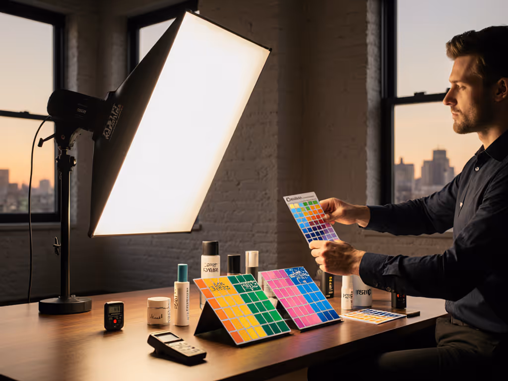
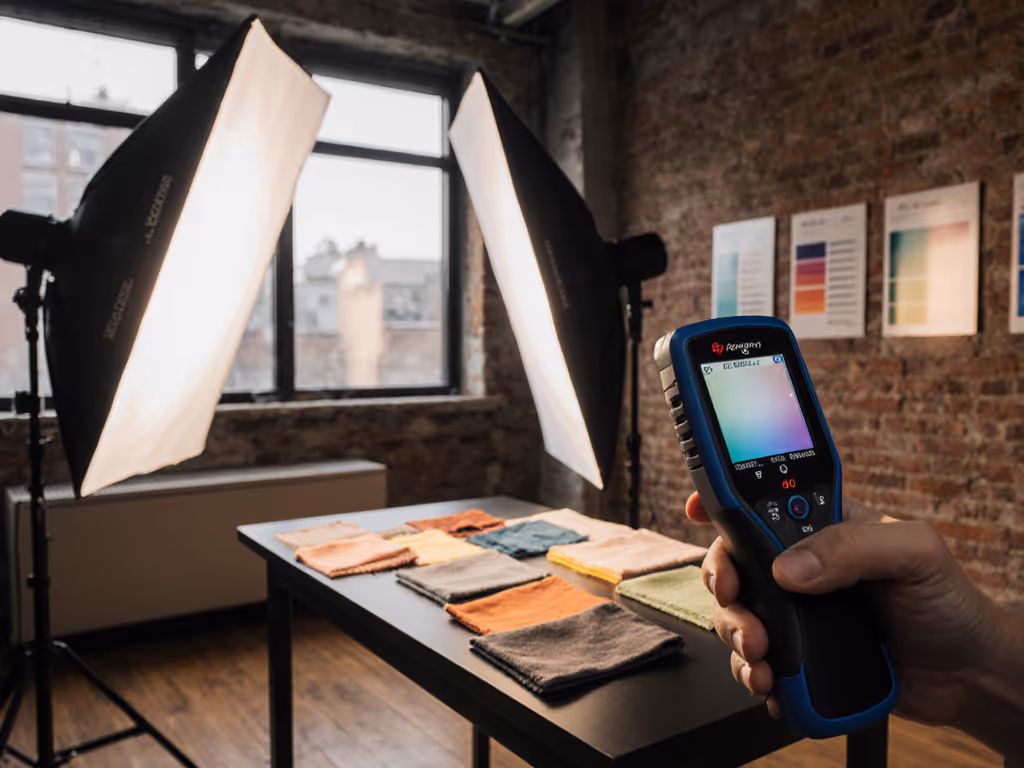
How can I test lighting setups for brand color fidelity without expensive gear?
You need three tools: a color checker chart, your camera, and free software. Here's my field-tested protocol for small-space shooters:
- Shoot a ColorChecker under your lighting (no window contamination)
- Capture RAW with custom white balance (not auto)
- Analyze in free software like ColorChecker Passport or Calibrite ColorChecker Analysis
- Check for skin tone patches (2R-4R) within 3 Delta E of reference
- Verify critical brand colors stay within 5 Delta E
Key diagnostic: If skin tones hit target but your brand's signature red appears orange, your light has insufficient 620-650nm output. This isn't a white balance issue. It is a spectral gap requiring light replacement, not grading fixes. I've prevented countless client disputes by catching this before the shoot, not after seeing returns flood in due to mismatched product color representation.
What lighting color temperature mistakes undermine emotional response?
Most creators fixate on CCT matching ("5600K for daylight"), but CCT only describes the blackbody curve, not the spectral quality. Two 4300K lights can have identical CCT but wildly different SPDs, causing:
- Mixed lighting pitfalls: Tungsten practicals (2700K) + "daylight" LEDs (5600K) create magenta spikes if LEDs lack red channel continuity
- Window contamination: Daylight at 6500K vs. your 5600K LEDs creates subtle blue spikes that wash out warm brand colors
- Dimming disasters: Most LEDs shift CCT when dimmed (e.g., 5600K to 6500K at 50% power), altering emotional response colors unexpectedly
Pro tip: For brand-critical work, set lights to 4300K (neutral gray point for most sensors) rather than chasing CCT matching. This creates a neutral spectral base where your brand colors render consistently, and minor adjustments through camera profiles beat fighting spectral gaps in post.
How do I maintain brand color impact across different camera systems?
Camera-specific transforms cause the "why do colors look different on Sony vs. Canon?" problem. Your workflow must standardize:
- White balance: Use a physical gray card under your lighting (not eye-based)
- Color profiles: Apply custom camera profiles built from ColorChecker captures under your specific lighting
- Log interpretation: Neutralize first in Log before applying LUTs. Never grade Log footage as if it's Rec.709
Most mismatched color across camera brands stems from inconsistent white balance targets and profile applications. A custom profile built under your lighting setup accounts for its spectral quirks, making skin tones first your anchor point across all systems. One food brand client reduced stills/video color mismatches by 78% simply by implementing this profile workflow across their multi-camera shoots.
Final Thoughts on Lighting for Brand Integrity
Brand color impact isn't about selecting the "right" color: it is about ensuring your lighting faithfully renders the colors you've carefully chosen. When skin tones look unnatural or product colors shift under different lights, you're not just dealing with aesthetic issues; you're eroding brand trust and driving returns. Spectral accuracy, measured through TM-30 and validated against skin tones, should be your non-negotiable starting point.
True color psychology lighting requires moving beyond marketing color theory's oversimplifications to engage with the physics of light. The next time you set up in a cramped apartment or storefront, remember: skin tones first; everything else negotiates around them. Measure your light's spectral behavior, validate with skin tones, then confirm your brand colors (in that order). This methodical approach eliminates guesswork and builds the color confidence your clients pay for.
Further Exploration: Deepen your understanding of spectral rendering by analyzing SPD plots of your current lights against CIE standard illuminants. Document how specific gaps correlate with color shifts in your test shots, and this builds the practical knowledge that turns theory into reliable on-set decisions.
Related Articles
Brand-Consistent eCommerce Lighting for Amazon Requirements
Prevent returns and color complaints by lighting for spectral integrity rather than relying on white backgrounds. Set TM-30 Rf/Rg targets, verify SPD with a spectrometer, and standardize setups to keep skin tones and product colors consistent across locations.
Product Photography Lighting: Natural vs Artificial Workflow
Learn practical, minute-by-minute workflows to control natural, artificial, and mixed lighting for color-accurate, repeatable product shots. Get checklists for metering, gels, flicker and power management, plus a simple logging system to recreate looks across locations.